Introduction
Il psychology of colors in art plays a crucial role in how we feel, think, and experience a space. Whether you are decorating your home or selecting a statement canvas, colors directly impact your mood and perception.
In modern home decor, understanding color psychology is no longer optional—it is essential. The right artwork can energize a room, create calm, or even improve focus.
What Is the Psychology of Colors in Art?
Il psychology of colors in art refers to how different colors influence human emotions and behavior. Artists and designers use color intentionally to evoke specific feelings.
Key Emotional Associations of Colors
- Blu – Calm, trust, serenity
- Rosso – Energy, passion, excitement
- Giallo – Happiness, optimism
- Verde – Balance, nature, renewal
- Nero – Sophistication, depth
- Bianco – Simplicity, clarity
These associations are widely recognized across cultures, making color a powerful global design tool.
Why Color Matters in Home Decor
Color is one of the fastest ways to transform a space. The psychology of colors in art directly influences how comfortable and inviting your home feels.
Benefits of Using Color Strategically
- Enhances emotional well-being
- Improves productivity
- Creates visual harmony
- Defines room purpose
For example, soft blues work well in bedrooms, while vibrant reds can energize living areas.
To explore curated artwork, visit:
👉 https://mamtajhariaart.com/shop/
7 Ways the Psychology of Colors in Art Boosts Mood
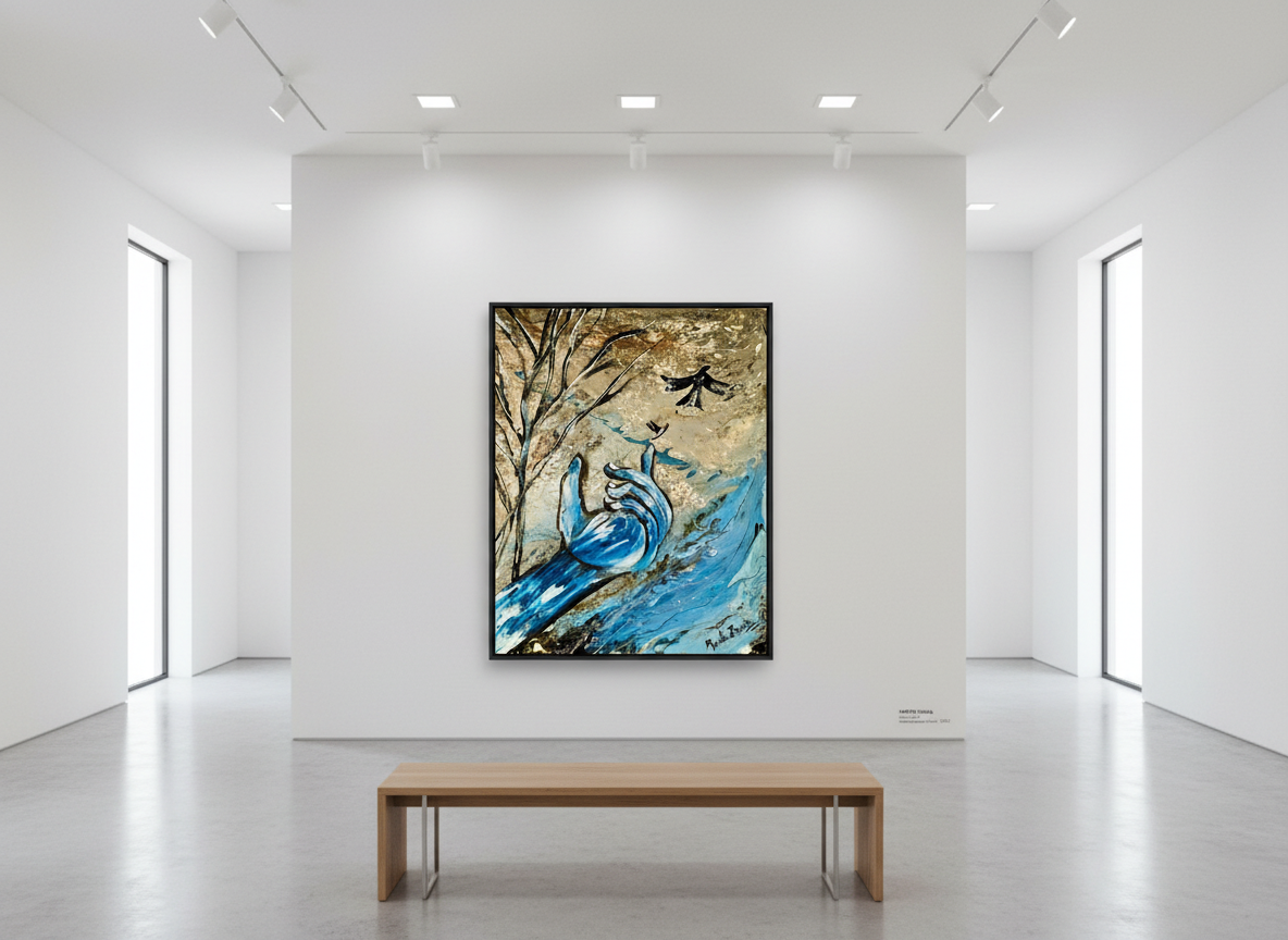
1. Blue Tones for Relaxation
Blue artwork reduces stress and promotes calmness. Ideal for bedrooms and reading spaces.
2. Yellow for Positivity
Yellow abstract art brings warmth and optimism into dull spaces.
3. Green for Balance
Green tones connect interiors with nature, creating harmony.
4. Red for Energy
Red accents stimulate excitement and conversation in social areas.
5. Neutral Colors for Sophistication
Beige, white, and grey create a minimalist and modern look.
6. Purple for Creativity
Purple hues inspire imagination, perfect for studios or workspaces.
7. Black and Gold for Luxury
These tones add elegance and depth to premium interiors.
Psychology of Colors in Art for Interior Design
Understanding the psychology of colors in art helps you design spaces intentionally.
How to Apply Psychology of Colors in Art at Home
- Match colors with room purpose
- Use contrast to create focal points
- Combine warm and cool tones
- Choose statement wall art
Explore original artworks here:
👉 https://mamtajhariaart.com/product-category/original-abstract-paintings/
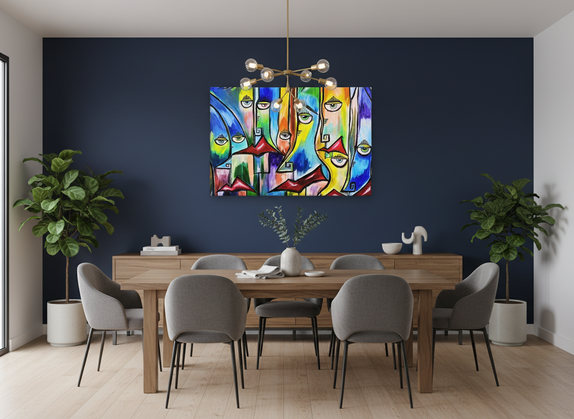
Using Abstract Art to Influence Emotions
Abstract art is one of the best ways to apply color psychology. Unlike traditional art, it focuses heavily on color expression.
Why Abstract Art Works
- No strict interpretation
- Emotion-driven visuals
- Versatile for all interiors
Canvas prints are especially effective in modern homes:
👉 https://mamtajhariaart.com/product-category/modern-art-prints/canvas-print-abstract-art/
Common Color Mistakes to Avoid
Even with knowledge of the psychology of colors in art, mistakes can happen.
Avoid These Errors
- Using too many bold colors
- Ignoring lighting conditions
- Not considering room size
- Overmatching decor
Balance is key. Always test colors before committing.
Expert Insight on Color Psychology
According to the American Psychological Association, colors can significantly influence mood, cognition, and behavior, reinforcing their importance in design decisions.
Conclusion
Il psychology of colors in art is a powerful tool that can transform your home and emotional well-being. By choosing the right colors, you can create spaces that inspire, relax, and energize.
Whether you prefer bold abstract pieces or subtle tones, intentional color selection will elevate your interior design instantly.